
Despite what modern society is preaching, there are so many obvious differences between males and females. These differences were always present and will always remain present.
Now, it is true that in some areas of our life these differences become less noticeable than in others, but one of those areas is not design – for obvious reasons.
Even though for decades, design has been a largely male-dominated field, that doesn’t hold true today. Today, the ratio’s closer to 50-50 than one would imagine.
Now that the design field (fashion, web design, or any other branch) is so gender-neutral, at least in terms of how many males and females occupy it, we can finally begin to explore the creative differences between men and women by judging and examining their creative work – not their gender.
So, do creative differences between female and male designers actually matter? Do designers approach their job differently because of sex? Is there such thing as male and female design? All that, and more – right below!
And, oh, before anyone gets triggered – these are generalizations that are backed by facts, science and experience, and while they don’t represent or define any individual, male or female, they generally hold true if you just take a look at the big picture.
Now that we’ve gotten that out of the way – let’s begin!
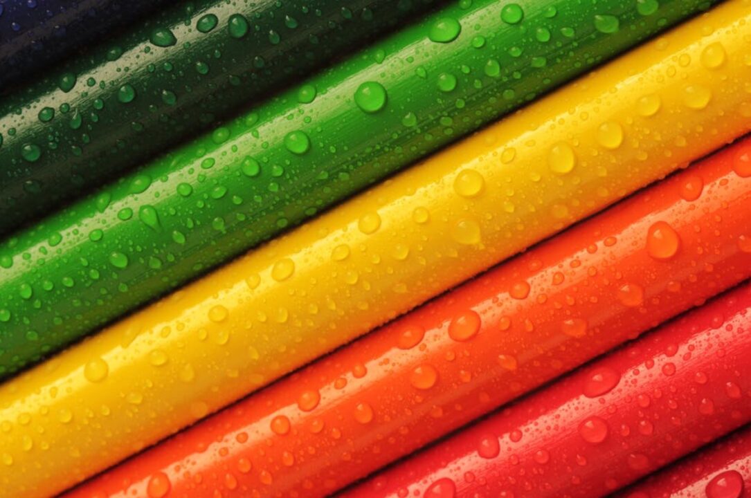
Colours
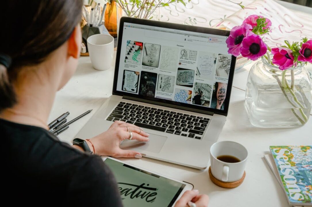
Source: pexels.com
The first and the most obvious difference you’re going to notice is colours.
We don’t know whether this is due to bringing up or just due to natural proclivity to colour, but what the recent study has shown is that those basic colour stereotypes are somewhat true.
As you know, with boys, it all starts with light blue when they’re babies. As time passes, boys graduate to blues, greens, and reds. The girls, on the other hand, start with light pink, and as time goes on, anything pink, purple, or fuchsia is “acceptable”. But, how does that affect women in design? Well, according to several recent studies – quite a lot.
Namely, both women and men were asked what their favourite colours were, and they both went with blue, red and green. However, the fourth colour for men was black (duh), yet the ladies chose purple.
What’s interesting about it is that they both agreed on the least favourite colours, too. Well, almost. Both genders picked orange and brown, with women adding grey to the tally. Do you know what men picked? Purple.
These differences are also very prominent when you take a look at the overall design approach. Women tend to gravitate to purple/pink colourways for their website or their creations – especially if they’re for other women.
Boys on the other hand do go with blue.
Naturally, we can’t forget about the middle ground and the neutral colours, which are, of course, a white-grey-black trio, as well as blue and light brown. Although, to be fair, with gender-neutral design, you will almost often see light blue, as darker tints appear “too masculine”.
Typography
Source: pexels.com
We don’t know about you, but we noticed a generous amount of ladies switching their fonts on their mobile devices to Comic Sans (or similar). So, are there any typography proclivities between the sexes?
Naturally, no respectable designer would ever use Comic Sans, so we won’t look at that as an example, but what we will do is, take a look at some of the typography often used by both female and male designers.
Now, we can’t lie, the most commonly used typefaces are definitely “gender-neutral” fonts – the classics. These typefaces are fairly tame in their design and are preferred by both men and women. Naturally, Helvetica is the absolute ruler amongst GNFs.
But, we turn the leaf over to the feminine and masculine fonts, and we tend to notice massive differences.
Ladies often gravitate towards curvy, smooth, rounded, almost cursive-like fonts. They’re often thin, a bit Italic in their nature. It’s fonts like these that are both used by and for ladies.
Men, on the other hand, tend to go for the whole masculine vibe with tough, strong fonts. You’ll see thick, straight lines, and almost geometric-like shapes to these letters.
So, there’s another.
Other Design Elements

Source: pexels.com
Design elements like iconography, page layout, imagery and photography used in the creative design are also almost distinctively feminine and masculine.
Let’s first take a look at iconography.
Just like with typography, icons and logos designed by men and women, for men and women, tend to have distinctive rough and smooth features.
As expected, men gravitate towards sharp and straight edges, as well as more saturated colours, whereas women often create soft, curvy icons dyed with softer colours.
As for the page layouts in graphic design, the differences are less obvious. There are some design rules that are followed by both men and women, but when you take a look at other incorporated elements, you may pick up on some clues as to whether woman or men has designed it.
However, this portion of the design is actually more influenced by who the design is for, rather than who is it created by. The only noticeable difference would be in the pages they design for themselves.
In the end, we have imagery and photography, and that’s where the differences often become very noticeable.
Overall tones and structure of images become almost distinctively feminine and masculine.
If you take a look at the photographs or images, both used by and created by men, you’ll see darker colours and a “tough” structure. You won’t see many feminine motifs, and even if you do, they tend to end up on the “edgy” side of things.
Women tend to do things differently. Their preferred images and photographs are often much lighter and feminine in nature – both in colour and structure.
Conclusion
There you have it – the main creative differences between male and female designers.
As you can see, they are so painfully obvious. And that’s a good thing. More than good, actually – it’s necessary.
Viewing this beautiful world through different lenses is what keeps the design and creativity alive. If all of us looked out in the distance and all saw the same thing – we’d never have this discussion.
So, embrace these creative differences. Hire your designers based on their strengths and proclivities. It’s a smart thing to do!