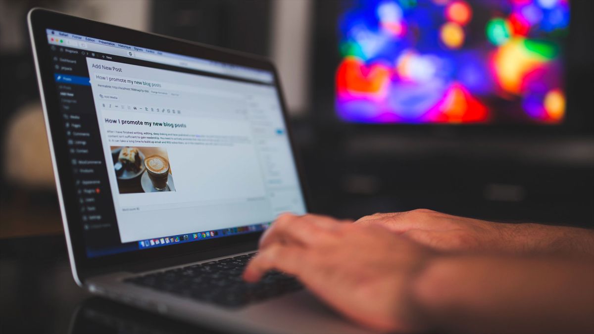
According to a recent UK survey, bloggers have proven to be the most trusted source of information. That is right – bloggers are more trusted than celebrities, journalists, brands, and politicians.
But how do you get people to fall in love with your blog (aside from notable content, of course)? Well, just like your website’s home page is the door to your business, so your blog design is the front door to your business blog.
If you are not visually addressing people, how are you going to get them to take the next step – to actually read (and hopefully subscribe to) your content? Once you are done creating high-quality content, you still face the challenge of presenting it. Images, text, and links need to be displayed just right, otherwise, readers could abandon your content if it is not aesthetically pleasing and easy to understand. This can be especially challenging for businesses whose blogs/websites can directly influence the company’s earnings from an audience such as the companies from the gambling industry. Here, for instance, crafting a great casino logo is one of the essential things to gain the trust of the customers, which is something casinos presented at TopCasinoExpert.com really pay attention to.
For that specific reason, we have put together a few examples of blog homepages to guide you on the right path to the perfect blog for your readers. But, first, here are a few tips.
Tips for a Great Blog

Source: simplyhatch.com
- Attractive website navigation. Having eye-catching website navigation that looks really good will help your audience explore your blog better.
Splash header. In the header, mention the most important parts of your blog and use it as a kind of area covered with graphical content to make sure people are heading in the direction they want. So, you should mention the most important content and give brief glimpses of the main pages of the blog. - Have a great footer. You are probably thinking – who is looking at the bottom of the blog? But it is surprising how many people actually do that. That is why it is nice to find a good ending for your blog.
- Next and previous posts. Once people read a blog, they often wonder where to go next. Look from your perspective – if you enjoyed the post, you will definitely want to read more. Find a simple yet effective solution. That way, it will send readers to the previous or next post, so it is a great addition that every blogger should consider.
- Feature. Your best post(s) should be featured within a slider on aside. Having a good post slider on your homepage with nice big splash images can really be a good way of greeting your visitors. That way, they can see the best content and catch up on what they have been missing since the last time they visited your blog.
- Create a custom heading using typography. Using a custom font and colors to make the headings stand out can do wonders on your blog.
- About the author. When someone has read a post, it is nice to attach a little author bio so they can see who is behind the blog. Nothing long, but it will still be better than just “Posted by …”
- Add breaking news feature. Breaking news is a really cool idea that gives urgency and importance to the content. This may work for any form of a blog that publishes new content on a regular basis.
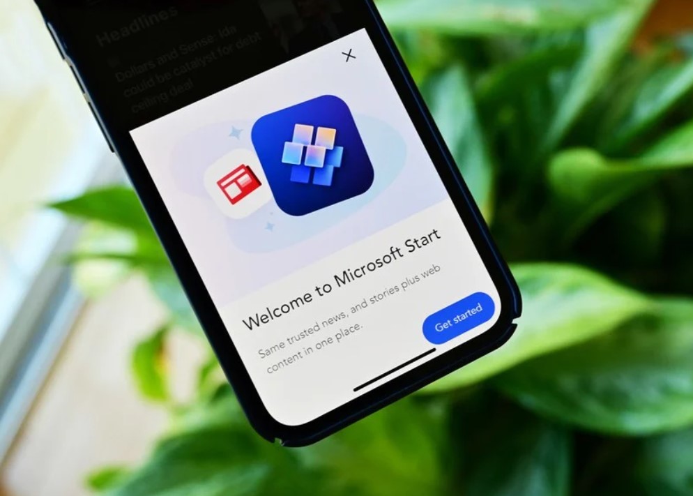
Microsoft Stories
Source: windowscentral.com
Is there a better way to revive an old-school brand than with a blog that is beautiful, interactive, and has inspiring-branded content? Furthermore, what provides, perhaps, crucial brand consistency is the square layout of these articles which resembles the Microsoft logo.
Microsoft Stories is also a great example of how a business blog can be an important part of a comprehensive rebranding. For the past few years, Microsoft has worked to humanize its brand, mostly in response to a rivalry with Apple. Its Stories used to have a simple slogan: “Look at the people, places, and ideas that move us.” It is kind of the informal side of Microsoft.
If you are trying to get across a specific brand message, your blog can be used to communicate that – both aesthetically and in terms of content.
Design Milk
Source: studiolorier.com
Design Milk, an online contemporary design store, uses a very simple layout to make its contributions stand out. The sidebar on the right, which remains visible when a blog post is opened for reading, is perfect for showing thumbnails for new articles. This is an internal linking strategy that helps encourage readers to stay on the page longer.
The social media icons above the list are a nice addition to the overall look and feel of the website. They are easy to spot and make it easier to share Design Milk’s content (it is always a good idea to add social buttons to your blog).
Mashable
Source: businesswire.com
Take note of the vivid colors, links, and contrasted text in the header. This is what draws the reader’s attention.
On the homepage, Mashable divides its material into three distinct sections. The smallest thumbnails on the left list the most recent posts. The “What’s Coming” posts are featured as huge thumbnails in the middle column, while the “Super” posts are shown as large thumbnails on the right. This three-pronged strategy to content display can assist readers in determining what form of news is most important to them – top attention-grabbing items or other posts that are currently trending.